Making my site look better on small screens
I’ve had this blog for five years, but I’ve only recently started using my phone to browse the internet, at which point I realised it displayed terribly on a small screen. It’s a wonder anyone ever read my posts.
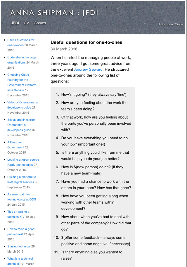
As a predominantly back-end developer, it wasn’t immediately clear to me what I needed to do to improve matters, so I thought it was worth making a note here once I figured it out.
Responsive design
You want the site to respond to information about the client accessing it to display in the best way for that client. In this case, I wanted the site to respond to browsers with a smaller screen and display differently, rather than just show everything as per a desktop browser but just much, much smaller.
The media query allows the site to get the capability of the device.
Redesign required
The first thing I needed to do was work out how I wanted the site to look on a mobile device, which actually took a bit of thinking about. I realised that the current layout wasn’t going to work well and, as is often the way of these things, probably already wasn’t working well.
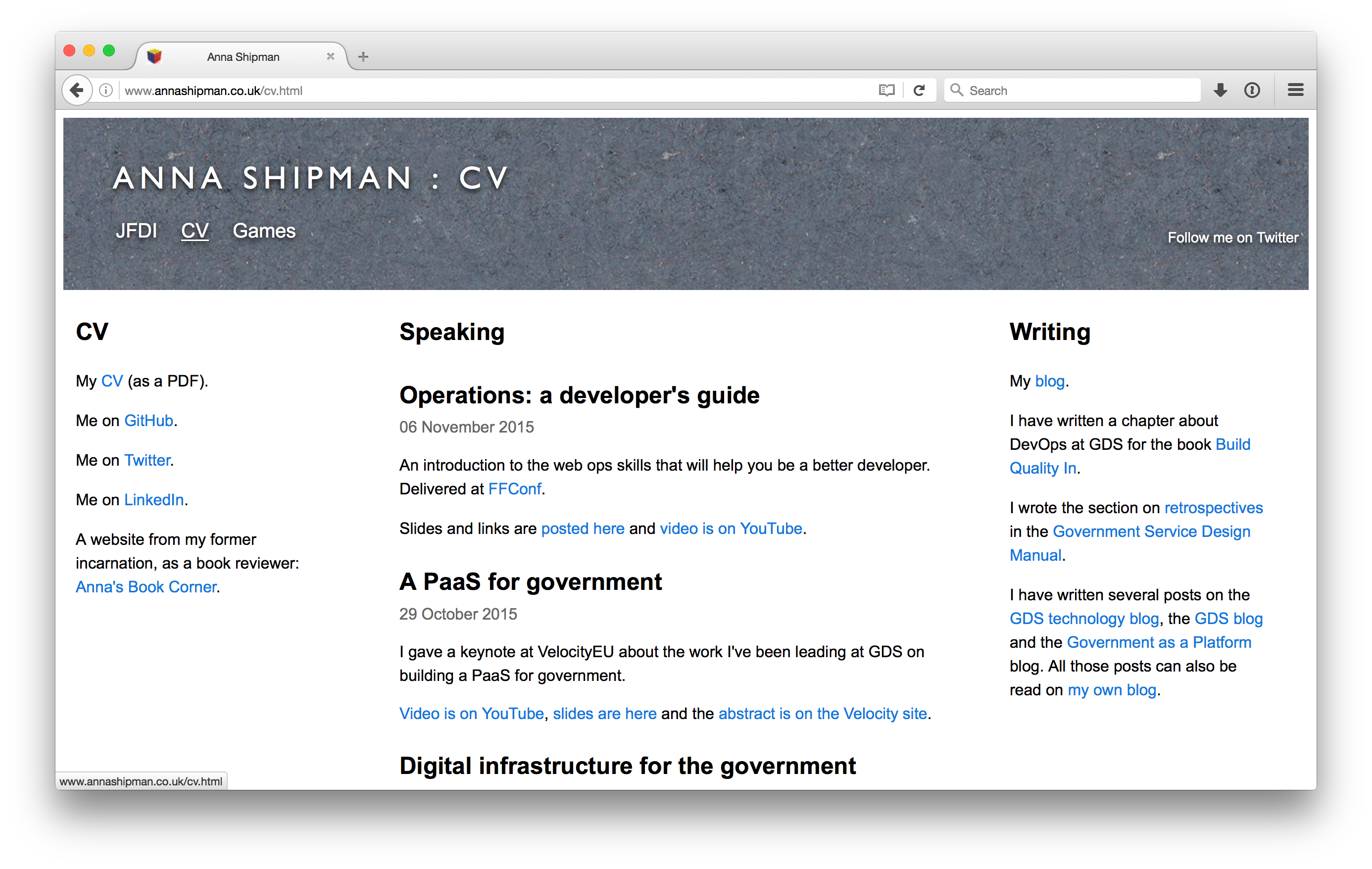
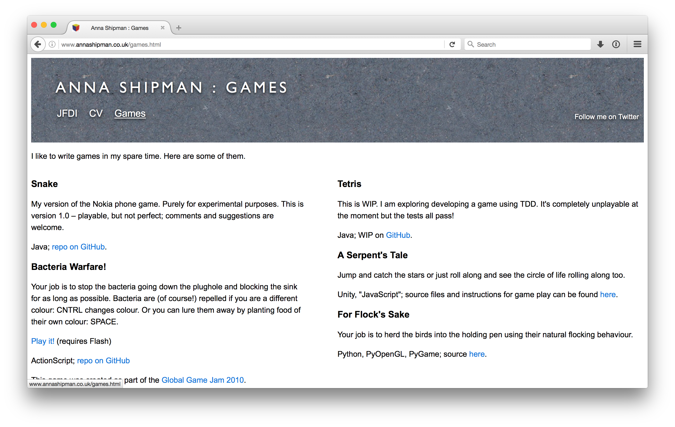
I was using a three column layout. However, on some pages the right column was left blank, and on one page I was instead using a two column layout. Only one page was making full use of the three columns. It was time to let it go.
Redirecting a URL
I took that opportunity to also rename the Games page. I used to spend more time developing little games; now I do a more diverse range of side projects so I can showcase more of that here. Because my site is hosted on GitHub pages I could not do a 301 redirect, but I set up a meta refresh tag to redirect to the new page. A 200 to a 200 is not ideal, but is better than a 404.
You can see the redesign changes I made on GitHub.
Use Jekyll for the whole site
When I originally started this blog I handcrafted the HTML for each post, and the rest of the site was also handcrafted HTML. My principle was just to get started rather than waiting until I’d figured out the best way to do it.
When I started using Jekyll, I only used the Jekyll features for the blog. However the redesign from the inconsistently applied three column layout made it much easier to Jekyllise the whole site and allowed me to remove a lot of the duplication and handcrafting.
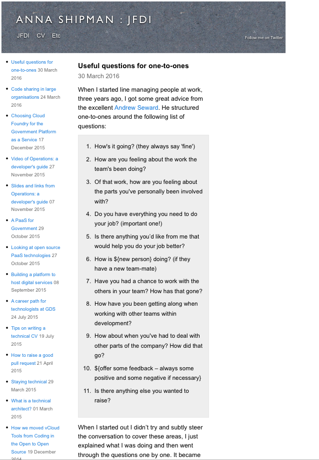
These initial changes actually made the site worse on mobile because there was more padding on the right.
Set viewport
The first change after the redesign was to add the viewport meta tag with an initial scale of 1. This sets the zoom level at 1:1 so the page is rendered at the width appropriate to the device width rather than zooming out to fit the whole page onto the screen.
Make embedded video responsive
After setting the viewport initial scale, most individual posts looked good on mobile. However the JDFI page has all the posts on it, and it looked very wrong. All the content was squished to the left.
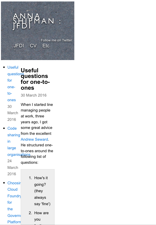
It turns out that the code provided by YouTube and SlideShare to embed videos/slides into your site is not responsive; it has a fixed width. This means that the site renders the text correctly for the size of the device, but when it gets to the fixed width video it then zooms out to allow space for it.

These two articles were useful in working out how to fix this. I changed the HTML to not have the fixed sizes and added some CSS.
It also turned out that on Safari (and hence on the iPhone) long lines of code were not broken, leading to the same effect as the fixed-width video, which I fixed with an addition to the viewport tag.
Only have two horizontal columns if device is large enough
Once I’d done all this set up I was at the point I needed to be, where I could change the layout based on the size of the device.
To do this, I looked through the CSS for anything that changes the horizontal structure of any of the elements, e.g. width, float etc, and put that inside a @media query block. Initially this was just the two columns but I later added the Twitter link.
Move columns into preferred order
After all these changes, I then changed the HTML to make the columns appear in the order I would like if they cannot be side by side.
There are many other improvements to make to this site but hopefully if you are reading on mobile it’s much easier. Do let me know!
If you’d like to be notified when I publish a new post, and possibly receive occasional announcements, sign up to my mailing list: